
Alright, we weren’t able to meet in person so we just chatted online for a few hours to get back into the same headspace. We confirmed which ideas are core to the game, which ideas are worth pursuing, and what our next steps are.
Cards
I put together a quick spreadsheet with a few ideas for the sorts of situations that would trigger a card to give Collin a framework to be creative in.

Collin: “I like more of the do style of cards rather than have. Have’s feel passive.”
Me: “I concur.”
The left column is just examples for now. We ran into a chicken & egg situation where Collin couldn’t think up cards without me first solidifying what the terrain types are going to be on the map tiles. (I guess that’s just an egg situation…)
Alright. Tiles, then!
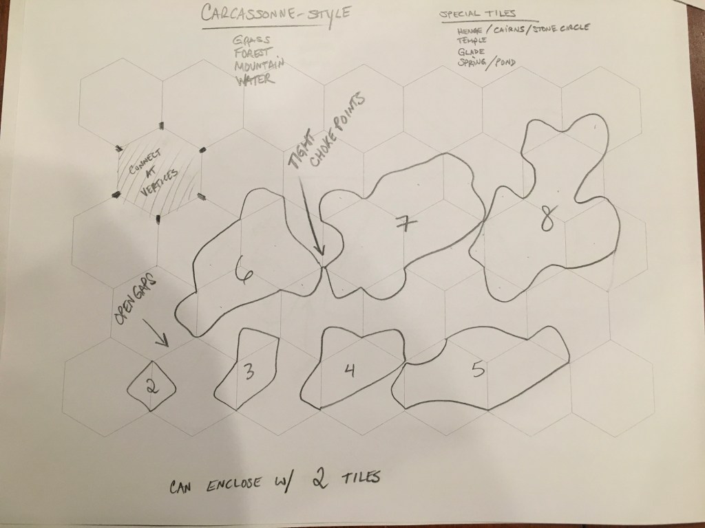
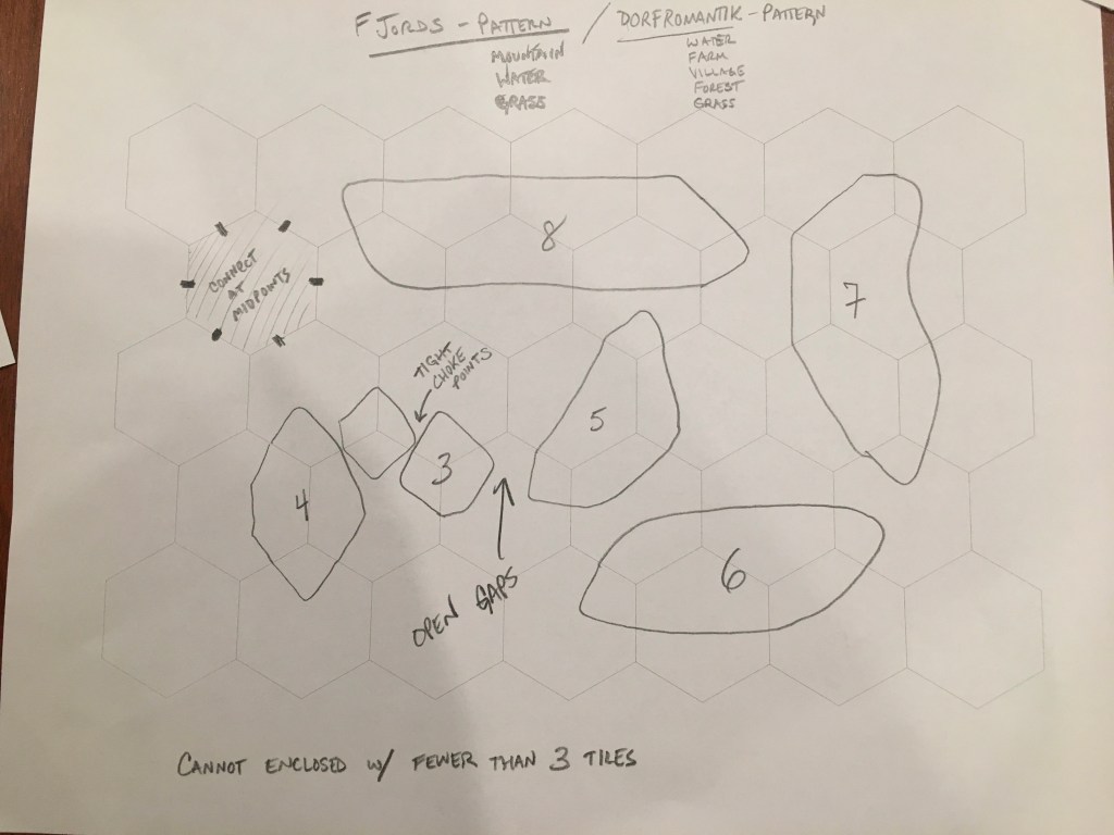
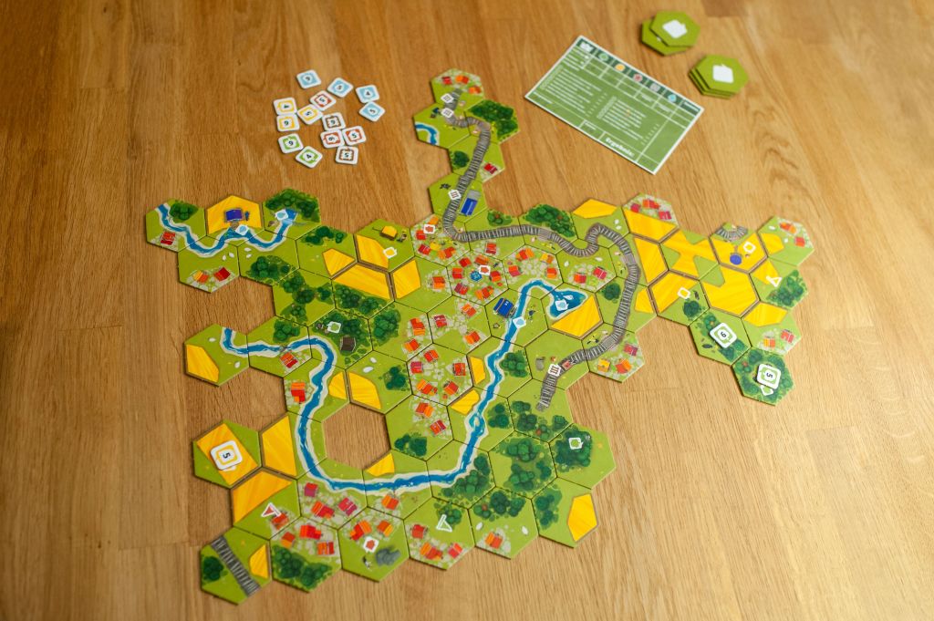
I sketched a few different approaches and messed around with the Fjords tiles a bit. I was exploring where the connection points should be – at the vertices of the hexagons or at the midpoints of each edge. Ultimately, I don’t think that decision matters all that much. Whichever is easier to draw. I think they both function adequately. The only real difference is how small an area you can make.
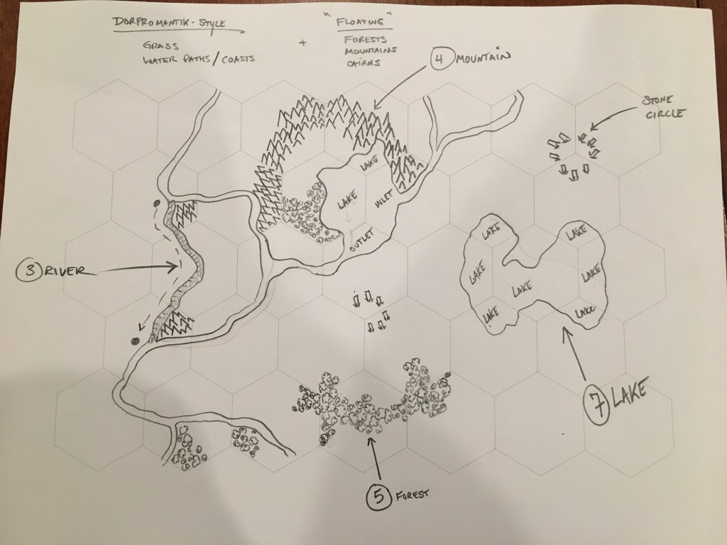
As for hexamorphic phases, I think I’m opting for a simple 3-phase hexamorph (rivers, lakes, and grass) with what I’m calling the “Dorfromantik style”, in that you can end a mountain range or forest adjacent to a grassy meadow and it will look just fine. In the video game you can put water next to grass and it will morph the edge into a “coast.” We won’t have that, so I’ll just say you can’t put those two things together.
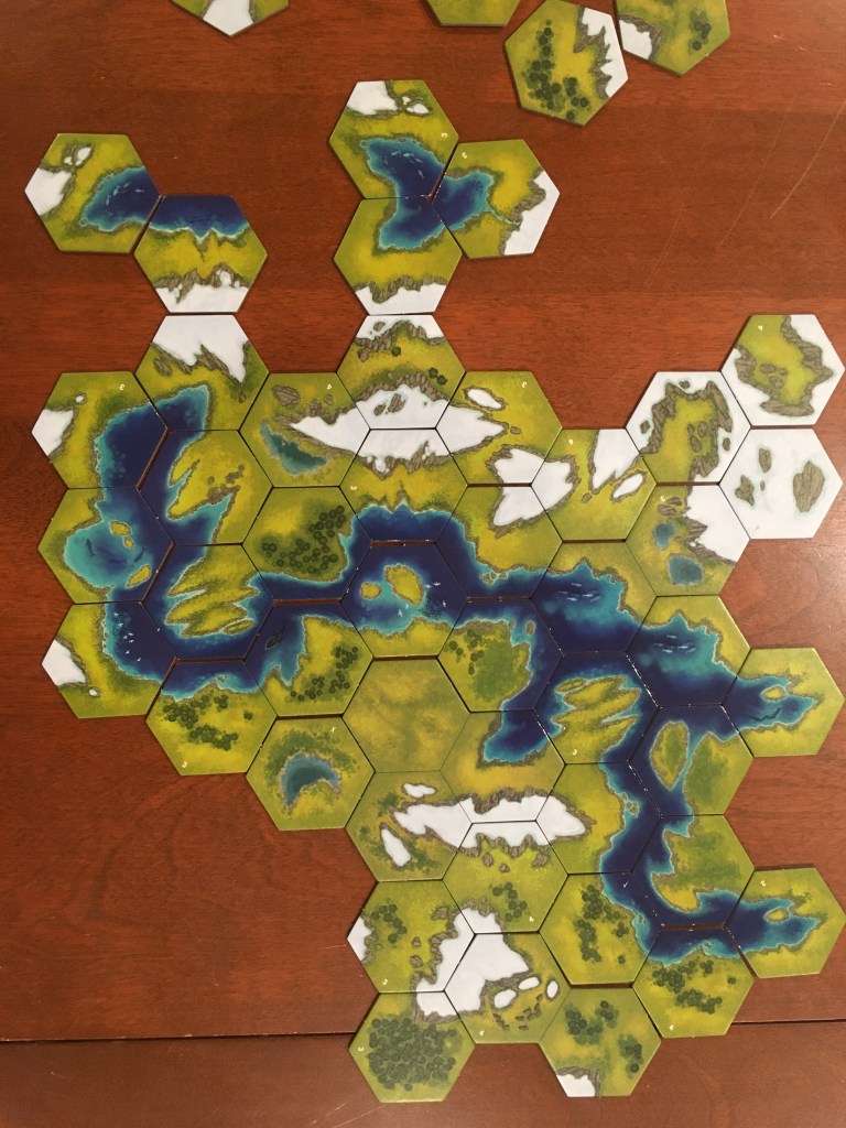
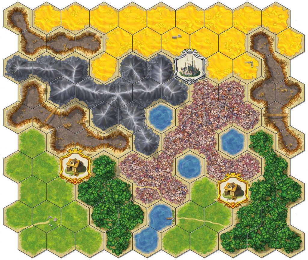
I’ll just have to draw the tiles in such a way that the grassy base layer looks fluid and natural. Archipelago does a great job of this. I’ve spent a lot of time scrutinizing the way these tiles fit together. The base layer is a grassy field. Clumps of jungle get so close to the edge of the tile you’d think it would make a hard edge, but it doesn’t. There’s a smidge of grass right at the very edge to ease the visual transition to the adjacent tile. The sandy beaches NEVER reach the intersection point. They always revert back to the default coastal edge, yet it looks perfectly natural. The mountain peaks live on the very edge of the tiles. This is the only part that looks a little jarring to me, but if you compare mountain ranges across other tile placement games, these are some of the best looking ones.
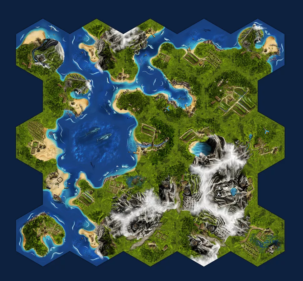
I really dislike when tile placement games have hard, geometric edges, and especially when they allow you to break the cohesion of the map artwork. It’s even worse for me when a game wants you to create a cohesive map, but allows you to break that cohesion whenever you want. Isle of Skye and Cascadia do this and I. Can’t. Stand. It.
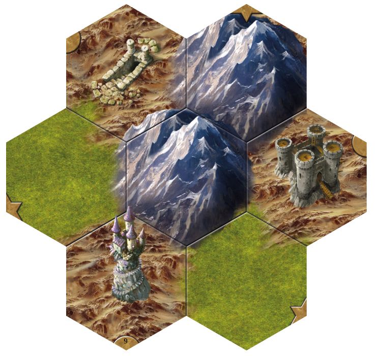
Here are some other approaches. These are more purely hex-based with with varying levels of attempt at hex-to-hex cohesion. I find them to be too geometric, even the ones that are gorgeous (Here’s lookin’ at you, Taluva). I want the Archipelago look and function, dammit!
/pic6277285.jpg)
:strip_icc()/pic332810.jpg)
Editor’s Note: I realize that my task would be made much simpler by just making each tile be one or two types of geometric terrain and to stop caring about artwork cohesion. The game could be made to function well enough and perhaps be more readable. …but I will die on this hill!
Carcassonne and Fjords force you to match every phase of the geomorph/hexamorph, which is very restricting. That works fine in those games where the tiles are the entire focus, but we’re trying to shift the focus to the card combos. In order for the combos to ever happen reliably, you’re going to need to be able to place a tile more freely.
Here’s where we landed:
- Mountain ranges
- Forest tracts
- Grassy meadows
- Hills
- Rivers
- Lakes/Coastal areas
The only artwork that must be obeyed are River-to-River and Lake-to-Lake connections. I’ll arrange the mountains, forests, and hills so that it looks natural for them to stop at any point (except against water). It will be something like …well …here. Dorfromantik did it with their boardgame. (In the bottom-center, that forest is 8 hexes big). Notice how the grassy base layer goes right to the edge of the forest, making a more seamless transition to the adjacent tile.
Is that it? Just terrain types?
We have a few ideas for additional map “features”, but they probably won’t be needed. I think it’s better if the map is simple enough to be intuitive, but rich enough to be interesting to look at. Allowing all these topographic features to be placed anywhere is going to allow cards to trigger more often. “Do I extend that forest, or cap it off? Should I start a new forest? Where can I put this tile to get my followers closer to the interior?”
We will probably have a few “special tiles” in there. Maybe they have their own special rules for point scoring. Source of the river, waterfall, cave, grotto, sacred grove, tallest mountain – things like that. It’ll be a random luck of the draw, so instead of them providing an immediate windfall to whomever happens to draw them (which happens in Carcassonne Hunters & Gatherers, which bugs us), they’ll probably operate more like cloisters or cathedrals in Carcassonne where if you really want the payoff, you’re going to have to focus on resolving them with future tile placements or follower migrations. This pulls your focus away from other things, so it’s a gamble you can choose to take or not.
I had more to say, but this post got a little long in the tooth, so I’ll keep it about tiles and stop it there.
Question for the Audience
This isn’t critical at this stage, but Collin and I discussed the “zoom-level.” Where you set the zoom-level has an impact on the artwork and feel of the game. How far are we from what is happening on this map?
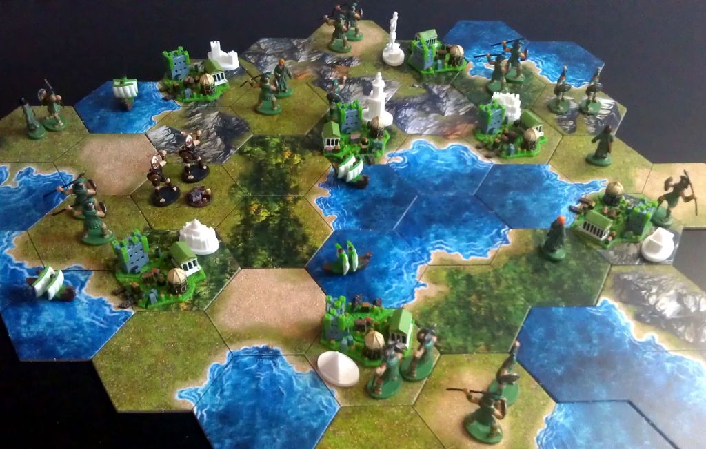
Dorfromantik is at the distance of a somewhat high flying bird. Fjords is probably closer to 30,000 feet.
What do you think the zoom-level should be for gods looking down from Mount Olympus? or, perhaps a better question, which zoom-level would be the most fun?
I think it needs to be far enough away to feel grand in scope, but close enough for me to sprinkle in fun little easter eggs in the artwork (Loch Ness monster, the Kraken, shipwrecks, ruins, small settlements, caravans). I think I want it to feel like the meeples on the map “belong” in that world, though not quite that close up.
Maybe this distance?
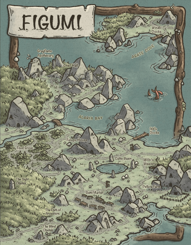
And while I’m looking at this artwork, I can’t help but wonder about the overall visual tone we want the game to have. I think it should look “fun.” This looks pretty fun. I’ll probably explore a bunch and write a post on this topic at a later date.
